ADITI Labs Brand Guide v2
Brand Overview
Company
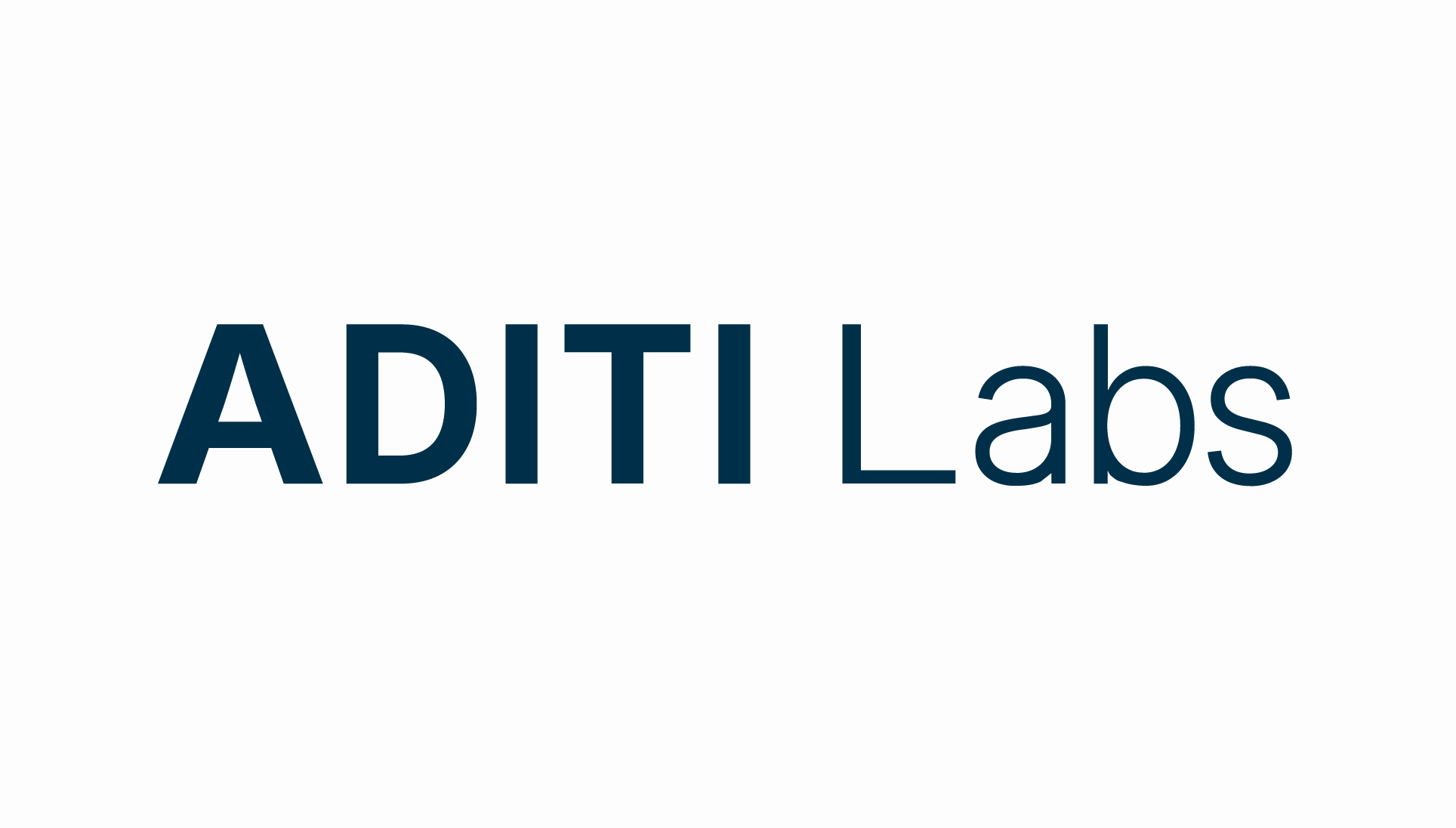
ADITI Labs
Tagline
Clarity. Capability. Momentum.
Mission (plain)
Building practical systems for better human-AI collaboration.
Wordmark version
2D (lighter Labs weight, more contrast)
Primary typeface
Inter (all weights)
Brand tone
Elegant, precise, non-moralistic, non-ornamental
Stage
Early / v1 established. v2 in progress.
Guide version
2.0 — June 2026
Core principle
Stay minimal. Let typography, space, and tone carry the identity. Every element added to a composition is a choice — not a default.
ADITI Labs Brand Guide v2
Color System - Brand
Primary brand color. Headers, nav, dark backgrounds, formal documents.
Accent only. CTAs, the 'ADITI' wordmark highlight, eyebrow labels, thin rules.
Page backgrounds, reversed text on navy/charcoal.
Body text on light backgrounds, captions, secondary labels.
Alternative dark section background. Slightly warmer than pure black.
SYSTEM USE ONLY. Errors, required field indicators, alerts. Never for brand expression.
ADITI Labs Brand Guide v2
Color System - Functional and Surface
Warm off-white surface color for section alternation. Card backgrounds, standard callout section backgrounds, alternating rows, formal documents.
Accent only. CTAs, CTA cards, important callout section - use sparingly, only to indicate significance.
Success row backgrounds, indicate positive or approved actions
Error row backgrounds, signals prohibited action or warnings.
Surface color rules
- ✓ Use surface colors sparingly to deliver maximum impact. Not required on every page.
- ✓ Use only if it serves a purpose that can't be solved more elegantly.
- ✓ Stay within the visual context of all pages on the site.
- ✗ Don't use surface colors merely for decoration or filler.
- ✗ Don't use surface colors as a replacement for Brand colors.
ADITI Labs Brand Guide v2
Typography
One typeface: Inter. Hierarchy is achieved through size and weight, not font variety. Inter is loaded via Google Fonts in this guide and in your Squarespace site font settings. ADITI's wordmark is a slightly modified version of Inter, built in Adobe Illustrator.
Page heroes, primary section headers
Section headings
Subsection headings, card titles
Small headings, sidebar labels
First paragraph of a page or section
All running prose
Captions, metadata, secondary UI
Above headings. ALL CAPS. Tracking: 0.1em. Color: Gold.
ADITI Labs Brand Guide v2
Typography - use of customization and lockups.
Use typography customization and lockups sparingly, for durable Brand-level assets only.

Reference example: Custom tagline lockup, used for placement over images across multiple platforms.
ADITI Labs Brand Guide v2
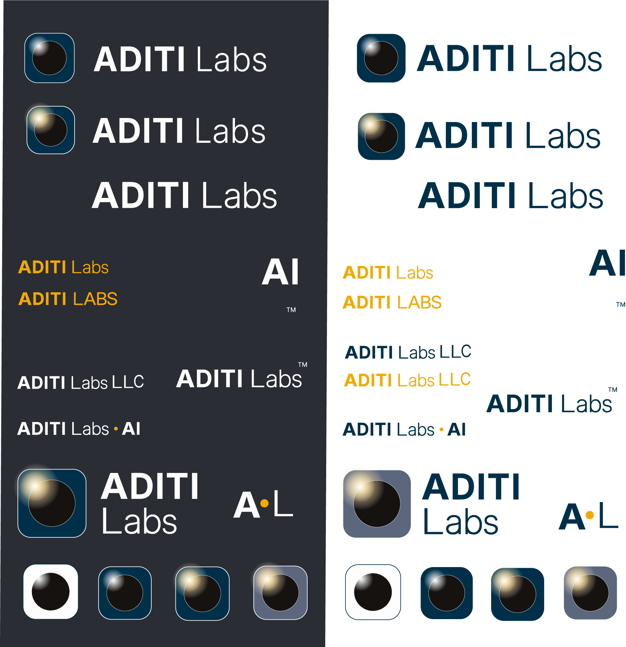
Logo & Mark Lockups
The lockup cards below show lockups in position. Lockup originals are in the website repo.
Deep Navy on White
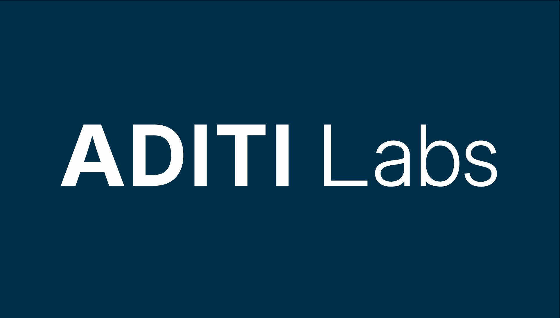
Soft White on Navy
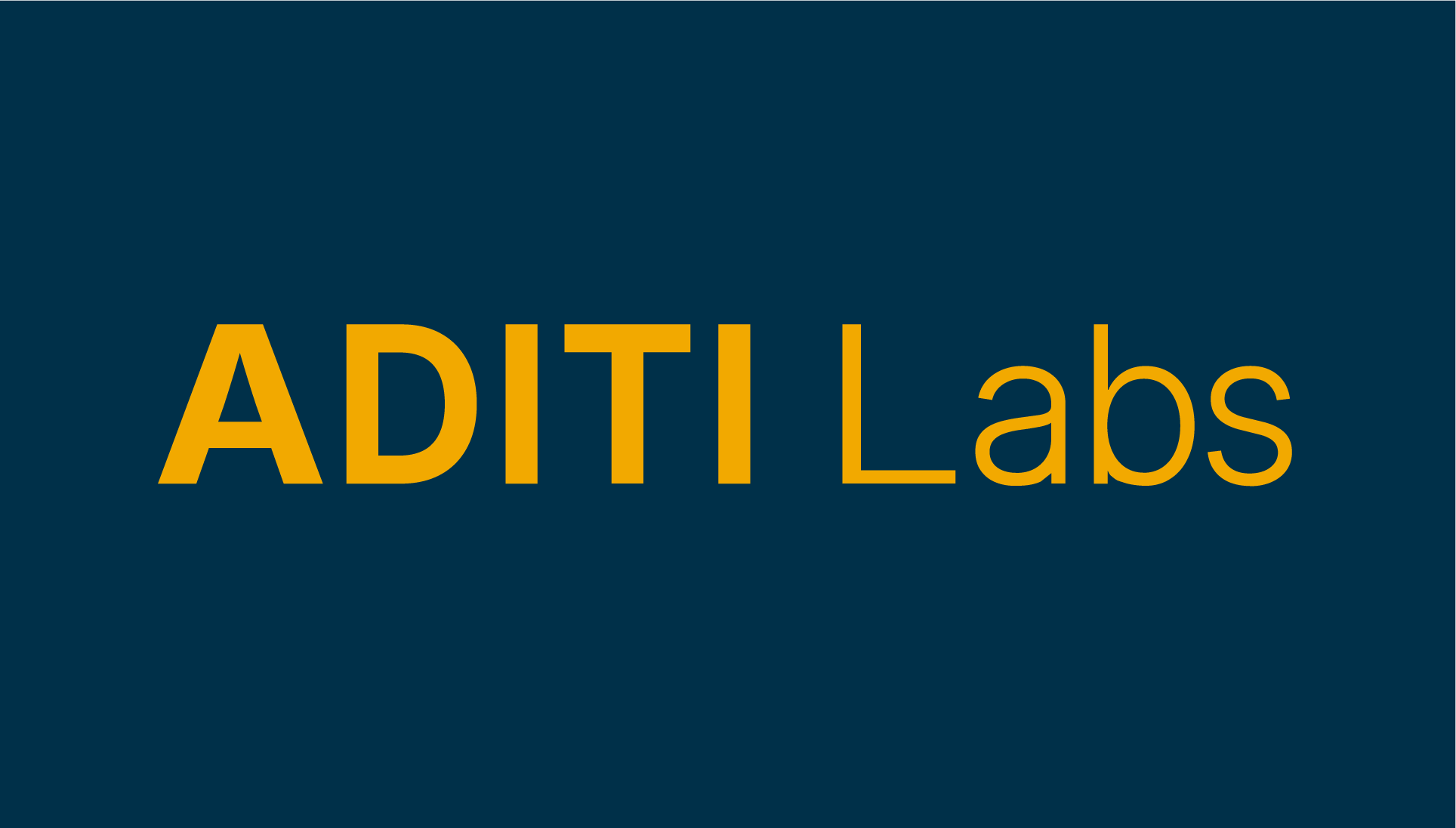
Gold accent on Navy

Orb — Full Color, charcoal variant

Horizontal lockup with orb

AL Monogram
When to use which mark
Clear space rule
Maintain clear space equal to the cap-height of the "A" in ADITI on all four sides of the wordmark. The orb minimum rendered size is 24px. Below that, use the AL monogram.
ADITI Labs Brand Guide v2
Logo & Mark - Examples of Approved Variants
Examples of approved lockups and variants. For the full set of lockup variants, pull originals from the website repo.
Examples of approved uses and lockup variants
ADITI Labs Brand Guide v2
Wordmark - Custom Letterform Details
ADITI's wordmark is precise and crafted. Though based in the Inter typeface, its customized letterforms and intentional kerning create a confident, grounded communication.

✗ BEFORE: Inter (bold), no custimization.

✓ ADITI wordmark (AI variant) approved lockup.

Details of ADITI's customized letterform A.
Before and After reference - customized letterforms in the ADITI Wordmark
- ✗ A before - Narrower stance, slightly pinched apex
- ✓ A after - Wider apex and stance increase stability, confidence, and clarity.
- ✗ L before - Shorter foot makes the wordmark feel less grounded.
- ✓ L after - Longer foot grounds the wordmark and improves the visual balance.
- ✗ a and b before - Smaller bowl and more distracting serif.
- ✓ a and b after - Larger bowl increases openness, legibility and visibility.
- ✓ customized kerning - Intentional kerning improves rhythm, legibility, and overall warmth.
ADITI Labs Brand Guide v2
Imagery & Infographics - Visual Philosophy
Images are permitted and encouraged when they add meaning, context, observation, or understanding. Avoid imagery used only as decoration, filler, trend signaling, emotional manipulation, or implied importance.
Reality is always larger than the person.
Not overwhelming. Not crushing. Just larger.
A quick glance should see one thing. A longer look should see more. Images should reveal more as viewers spend time with them.
The image should feel discovered rather than staged, even when it is completely constructed.
The purpose of imagery is not to attract attention. The purpose of imagery is to direct attention to something meaningful. Business outcomes may follow. They are not the primary objective of the image.
ADITI Labs Brand Guide v2
Imagery & Infographics - Visual Language
Visuals should support and elevate the effectiveness of the overall communication. They may reward a viewer's careful attention, without requiring it.
Consider the attentional gravity of an image. Ensure that it supports the communication objective.
Images should never distract from, compete with, harm, or contradict ADITI’s brand messaging and core values.
Only use images that somebody could have genuinely noticed.
When using images of people:
Represent human presence, experience, and participation honestly and with dignity, but not in overly solemn, moralistic, aspirational, or generic ways.
Human imagery should show participation, attention, care, learning, collaboration, or discovery.
- ✓ Prefer moments over poses.
- ✓ Prefer activity over performance.
- ✓ Prefer genuine engagement over symbolic "professionalism.”
The ADITI aesthetic is:
- observed rather than staged
- specific rather than generic
- quiet rather than loud
- natural rather than corporate
- real texture
- earned depth, natural structure
- room for interpretation
Value the viewer’s time, attention, and intelligence.
Images may communicate humor, playfulness, familiarity, emotional tone, emphasis, rhythm, rest, nuance, persuasion, or commitment when those elements support the communication.
These are tools, not requirements.
No image needs to accomplish all of them. Most strong images accomplish only one or two exceptionally well.
ADITI Labs Brand Guide v2
Imagery & Infographics - Representational Honesty
Representation should be truthful.
Synthetic content is permitted. Synthetic content should not imply real people, events, customers, outcomes, or relationships that do not exist.
AI participation may be acknowledged when material to understanding provenance.
Trust takes precedence over aesthetic convenience.
Guiding principles
- Be truthful.
- Be observant.
- Be thoughtful.
- Don't become pompous.
- Don't become beige.
- Be clear.
- Remain accountable to observation.
- Don't imply what isn't true.
- Don't manufacture emotions the content hasn't earned.
ADITI Labs Brand Guide v2
Imagery & Infographics - Visual reference guide

Visual reference guide v. 1
ADITI Labs Brand Guide v2
Imagery & Infographics - Counterexample moodboards
This is not a comprehensive set, it is just a few things to watch out for. (nb: these images are not ADITI IP)
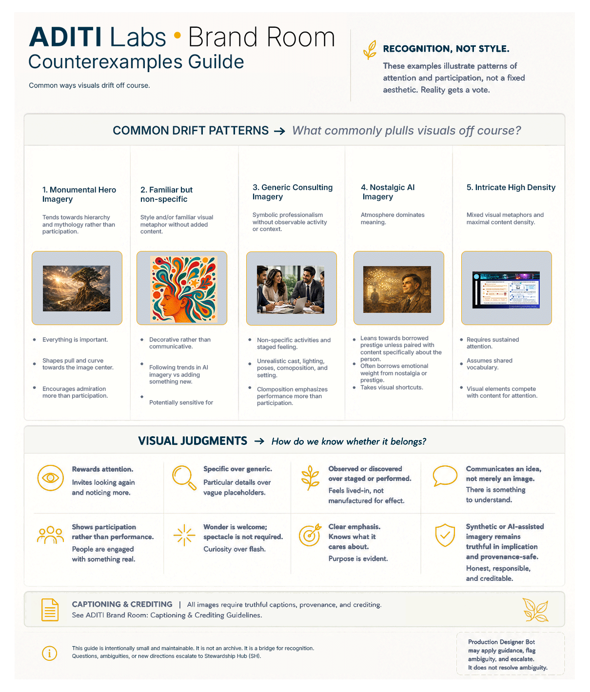
Visual counterexamples reference v. 1
ADITI Labs Brand Guide v2
Imagery & Infographics - Operations
Process governance
All image and infographic use requires an HITL approval step prior to go-live.
Keeping creation and approval distinct protects both judgment and exploration. Independent review helps identify blind spots, while allowing creators the freedom to pursue unexpected directions during the discovery process.
Captioning and crediting
Use captions and credits when they improve clarity, provenance, attribution, or understanding.
Only use imagery ADITI has the rights to use.
ADITI Labs is both AI-positive and human-positive. Credit creators appropriately. When AI participation is material to understanding the origin of an asset, acknowledge it clearly and proportionately.
Fact-check all infographics prior to publication and document sources when appropriate.
Transparency should support trust and understanding. It should not become clutter, distraction, apology, or performative disclosure.
Only use imagery ADITI has the rights to use.
Use the simplest disclosure that communicates what a reasonable viewer would need to know.
Usage and placement
The default position is no image. Type, space, and color carry the brand. Images earn their place by adding meaning the text cannot. When in doubt, remove the image and see if the page improves.
When type is used over an image, the effect should be harmonious and legible. Darkening and lightening areas of images for type should be invisible corrections once completed.
Before adding an image, ask:
What does this image help the viewer understand that the text alone cannot?
Production checklist
- Does this image add meaning text cannot?
- Is it truthful/provenance-safe?
- Does it support the communication objective?
- Is it ADITI-specific rather than generic AI trope?
- Has HITL approved it?
Adjustments for legibility
Whenever type is used over an image, the effect should be harmonious and non-distracting. Type should always be legible. Darkening and lightening areas of images for type should never be noticeable once completed, and should not negatively impact the visual communication of the image.
Sequencing and Sizing
When using multiple images, ensure that their placement, sequencing, and sizing support overall visual communication objectives.
Placement example

LinkedIn banner example
Image usage and intensity guidance
Heavy imagery appropriate
- Social posts
- Articles and essays
- Presentations
- Thought leadership
Moderate imagery appropriate
- About page
- Studio pages
- Selected landing pages
- Platform profiles
Minimal imagery appropriate
- Documentation
- Governance artifacts
- Reference materials
- Token libraries
- Notifications and automated messages
FPO asset placeholder
Approved for internal use only, as a placeholder image during layout creation or updates. May also be used as a placeholder while awaiting assets from a collaboration partner. Original is in the website repo.
Squarespace asset link: https://images.squarespace-cdn.com/content/685c6eeed7b5d32f30e5edb9/9b5babc8-b894-4876-9583-28718061a4ca/FPO.png?content-type=image%2Fpng
For internal use only - FPO image placeholder
ADITI Labs Brand Guide v2
Voice (embedded — standalone guide with tone, language and emoji use forthcoming)
ADITI Labs — Parent Brand Voice
Tone: Elegant, precise, iconoclastic — not ornamental or moralistic.
Register: Peer-to-peer. Not expert-to-novice. Not brand-to-consumer.
Avoids: Spiritual jargon, therapeutic framing, universal claims, hype.
Focuses on: State modeling, dynamics, calibration, clarity.
Use on: Website, LinkedIn, GitHub, documents, proposals.
The Studio — Product Voice
Tone: Warm, exploratory, responsive — meeting people where they are.
Register: Collaborative, not directive. Curious, not prescriptive.
Avoids: Jargon, performance pressure, false urgency.
Focuses on: Next steps, clarity, honest reflection.
Use on: Studio pages, Substack (transitional), Studio UI copy.
Know which voice you're in before you write.
The two voices are not interchangeable. Defaulting to The Studio's warmth in a LinkedIn post makes ADITI Labs sound soft. Defaulting to the parent brand's precision in a Studio session makes it feel cold. The product is warmer than the company — that's intentional.
ADITI Labs Brand Guide v2
Dos & Don'ts
These cover genuine ambiguity cases — things you or a collaborating LLM might actually get wrong. Obvious rules are omitted.
Logo Usage
Use the wordmark (2D weight) as the primary identifier in almost all contexts.
Use the orb icon for 1:1 ratio contexts: favicons, avatars, app icons, Discord server icons.
Use the horizontal lockup (orb + wordmark) for product contexts like The Studio header.
Don't use the orb as a decorative element on every page. It's a mark, not a texture.
Don't place the wordmark on gold backgrounds. It loses legibility and looks accidental.
Don't scale the logo below 24px (wordmark) or 16px (AL monogram). Use the orb at those sizes instead.
Don't stretch, rotate, recolor, or add effects to the wordmark or orb.
Color
Use gold as an accent — for one element per composition (a rule, a label, a CTA, a wordmark highlight).
Use Signal Red only for system states: errors, alerts, required field markers. It has no brand role.
Lead with navy + white in formal or print contexts. Reserve charcoal for digital-only dark sections.
Don't use gold as a background color for large areas. It reads as a warning, not a brand.
Don't use Signal Red in marketing copy, social posts, or any non-UX context.
Don't combine gold text on navy at small sizes — contrast is good, but gold at 12px is hard to read.
Don't introduce new colors. The palette is complete. If something feels missing, ask whether the layout or hierarchy is the real problem.
Typography
Use eyebrow labels (all caps, gold, wide tracking) above section headings to create hierarchy.
Use Inter Regular for all body text. Medium for UI labels. Bold for headings only.
Let type scale carry hierarchy. Resist adding more weight variants or colors to compensate for weak structure.
Don't use italic for emphasis in body copy. Use sentence structure instead.
Don't mix font sizes within a single heading. One size, one heading.
Don't underline text except for hyperlinks.
Imagery
Use abstract system graphics, minimal node maps, and light-field/depth photography consistent with the LinkedIn forest banner.
Use the orb as the primary visual anchor when a strong focal point is needed.
Leave room for the brand to breathe. Negative space is not a design problem — it's the design.
Don't use stock photography of people in meetings, handshakes, or computers. It conflicts directly with the brand's intellectual credibility.
Don't use spiritual imagery, mandalas, chakra graphics, or anything that implies a belief system.
Don't use AI-generated faces or abstract 'brain' imagery. Visual cliché in this space.
Don't use imagery as decoration. Every image should earn its place by adding meaning the text can't carry alone.
Voice (see standalone guide)
Write in the active voice. Prefer short sentences at key moments.
Use The Studio voice (warmer, exploratory) for Studio-specific content.
Use ADITI Labs parent voice (precise, layered, non-moralistic) for company communications, LinkedIn, GitHub.
Don't write 'we believe' or 'we are passionate about.' State what you do and how.
Don't use therapeutic or spiritual jargon: 'journey,' 'healing,' 'wholeness,' 'transformation' in the brand sense.
Don't confuse the two voices. The Studio is warmer. ADITI Labs is sharper. Know which context you're in.
LLM note: Don't default to encouraging language ('Great question!', 'Absolutely!'). The brand voice is direct. Match register to context.
Accessibility
For new page designs or major website changes, meet WCAG accessibility requirements.
ADITI Labs Brand Guide v2
CSS Tokens
A separate aditi-tokens.css file is provided alongside this guide. Paste its contents into Squarespace → Settings → Advanced → Code Injection → Header. This defines all variables once, site-wide. Individual page code then references var(--token-name) instead of hardcoded values.
Quick reference — most-used tokens
/* Color */
color: var(--color-navy);        /* #003049 */
color: var(--color-gold);        /* #F2A900 */
background: var(--color-white);  /* #FDFDFD */

/* Type */
font-size: var(--text-base);     /* 1rem / 16px */
font-size: var(--text-2xl);      /* 2rem / 32px */
font-weight: var(--weight-bold); /* 700 */

/* Spacing */
padding: var(--space-8);         /* 2rem / 32px */
gap: var(--space-4);             /* 1rem / 16px */

/* Error states (system use only) */
color: var(--color-signal-red);
background: var(--color-signal-red-bg);
Implementation note for novice coders
You don't need to rewrite all existing page CSS at once. Start by pasting the token file into global header injection. Then, when you touch a page for any other reason, swap hardcoded values to variables. Over time the pages self-consolidate. Don't do a big-bang refactor — it's not worth the risk on a live site.
ADITI Labs Brand Guide v2
Social Media System
Approach: Navy or charcoal backgrounds. Wordmark in top-left or bottom-left. Gold accent for key stat or label. Copy: formal but direct. No emojis in company posts.
Bot rules: Always include wordmark lockup. Lead with a concrete observation. End with one question or CTA. Max 3 hashtags.
Avoid: Gold backgrounds, the orb as primary image, inspirational quotes without substance.
Approach: More visual latitude than LinkedIn. Navy or warm white backgrounds. The orb can anchor image posts. Abstract system graphics or high-contrast typography work well. Minimal text on image — move copy to caption.
Bot rules: Use pre-approved image templates. Caption length: 100–150 words max. Use line breaks for readability.
Avoid: Stock photography, human faces, spiritual iconography, cluttered layouts.
Approach: Text-first platform. Sharp, specific observations. One idea per post. Can be more informal than LinkedIn. Gold sparingly in image posts.
Bot rules: Keep to 200 characters or under for readability. No threads from bot without human review.
Avoid: Overly polished brand-speak. Engagement bait. Posting frequency over quality.
Approach: Minimal. Navy wordmark or orb avatar. README: clean markdown, no decorative banners. Voice: precise and technical, consistent with ADITI Labs parent brand.
Avoid: Badge overload, decorative GIFs, informal voice that conflicts with site.
Approach: Currently under Jean's name, not brand. When transitioning: navy or warm white. Header images should be typographic or orb-based, not illustrative. Voice: The Studio voice (warmer, more exploratory) is appropriate here.
Bot rules: No bot. Substack is a human voice channel.
Avoid: Generic newsletter aesthetics. Over-designed headers. Mismatched voice — don't use formal ADITI Labs parent voice here.